



Inside the Label: What Every Symbol on a Saraceni Bottle Means
Most wine labels are designed to be studied, not read — a paragraph of tasting notes, a coat of arms, a vintage chart nobody at the table actually consults. Ours were built to do the opposite: tell you what you need to know in the time it takes to reach for the bottle.
Why our labels look different on purpose
When we started designing labels, the goal was to strip out everything that exists mostly to sound impressive. No invented heraldry, no dense paragraph of tasting language borrowed from a sommelier's notebook. What's left is deliberately minimal: the name, what family it belongs to, and — where it matters — a visual cue for what to expect in the glass.
What's actually on there
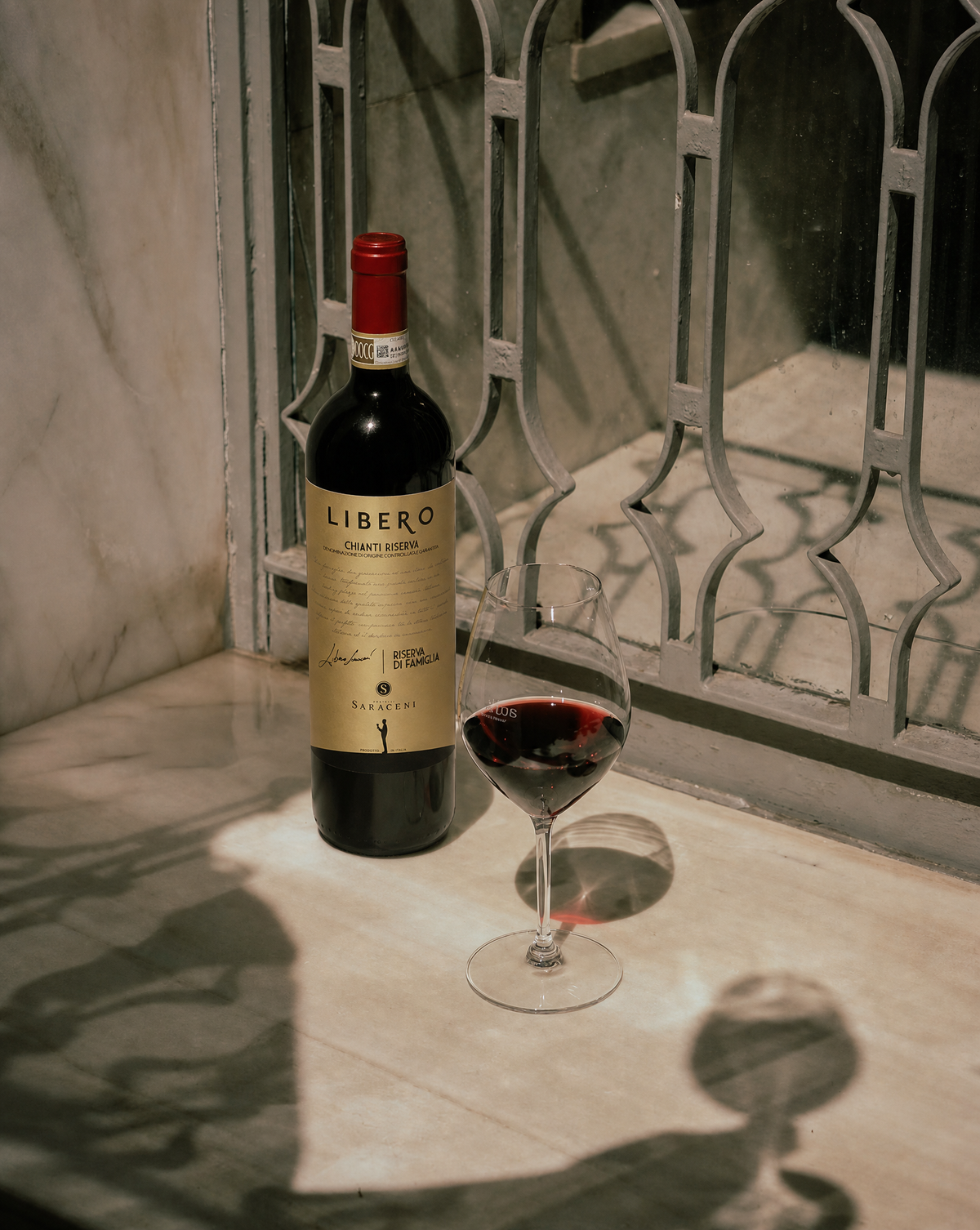
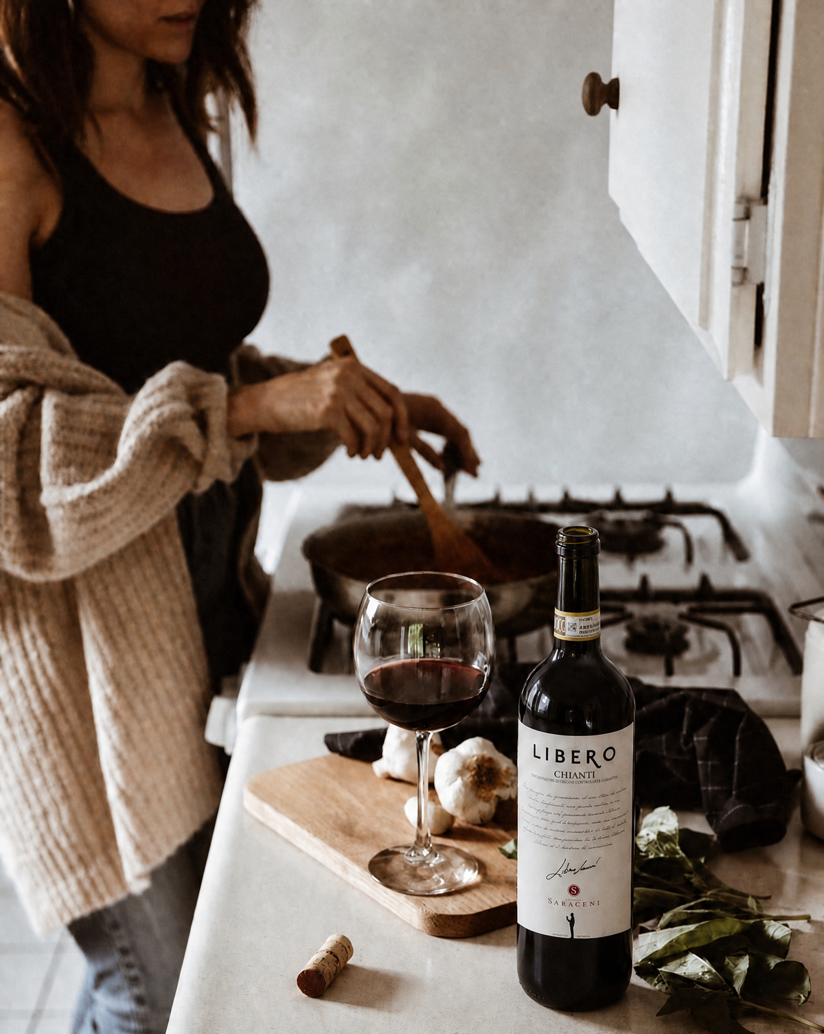
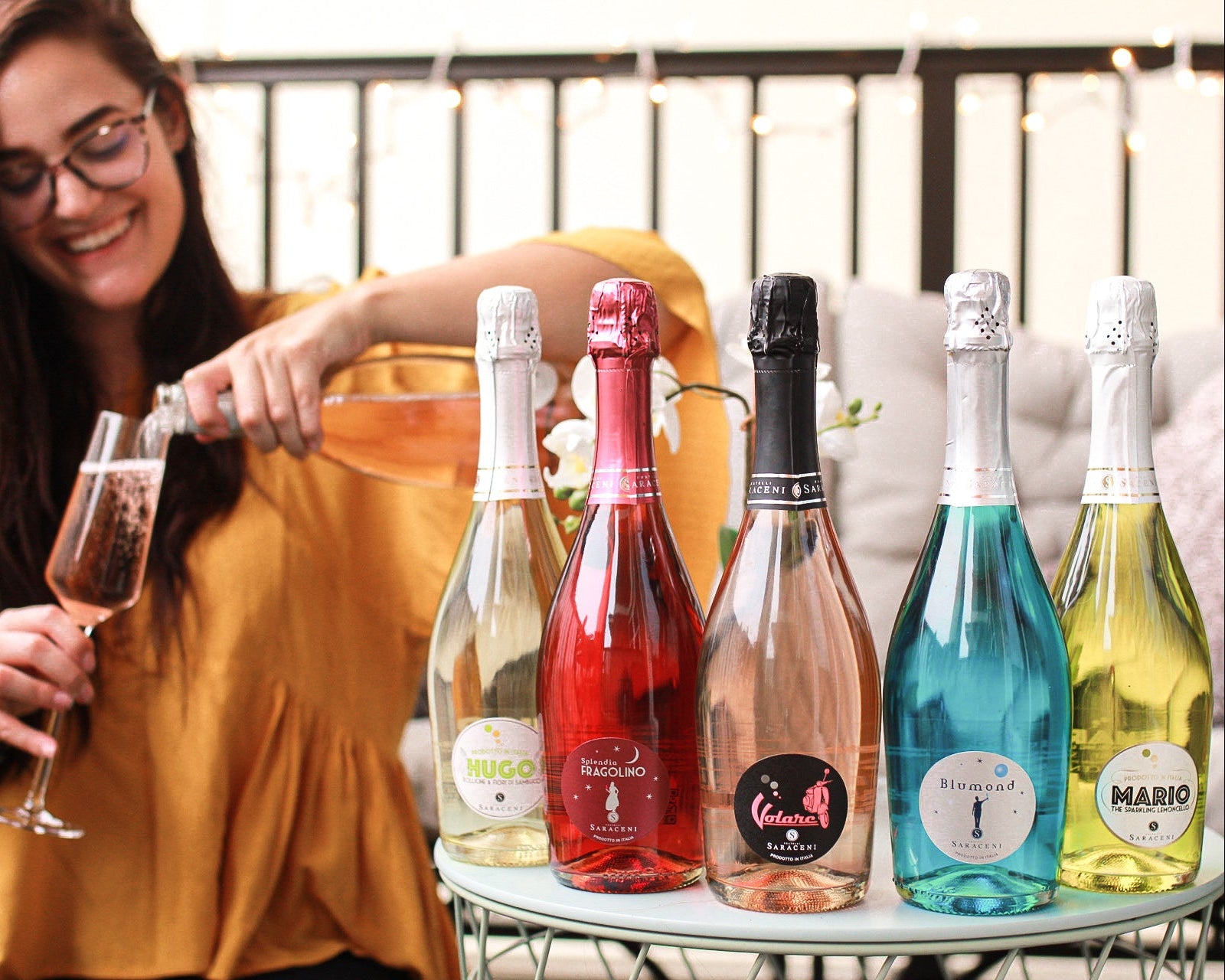
The name is doing more work than it looks like. Blumond, Splendia, Volare, Libero — each one signals a different occasion before you've read another word. Libero, our Chianti DOCG line, carries our father's name on purpose; it's less decoration than a way of keeping him at the table.
The family it belongs to matters more than most people realize. Our sparkling, social wines (Blumond, Splendia, Volare, and the rest of that world) are built for attention and celebration — color, chill, shareability. Libero and our estate wines are built for the dinner table — food-first, heritage-forward, meant to be poured slowly rather than photographed first.
Origin, when it's relevant, tells you where in Tuscany a wine actually comes from — not as a prestige flex, but because place genuinely shapes what's in the glass, especially for the Libero and estate lines.
What we leave off, and why
You won't find a wall of tasting notes on a Saraceni label, and that's intentional. We'd rather you taste it yourself than read someone else's adjectives first. If you want more detail than the label gives you, that's what this blog — and our team — are for.
Shop the full collection and see the label system in person.